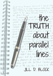
 Once I committed to self-publishing The Truth About Parallel Lines, it was up to me to come up with a cover. I had some ideas. I found an iPhone app that let me try different things. During down time at a law firm partners’ retreat in Scottsdale, I wrestled with images of parallel lines appearing to converge in the distance. I played around with cityscapes and skylines. I was pretty fond of an unmade bed. But nothing really clicked. (You can take a look at some of my early efforts, below.)
Wandering on the internet, I came across a photograph of a pen lying rakishly across a page of handwritten text. Bingo. The actual words on the page didn’t entirely make sense for my purposes but, I figured, who besides me would even bother trying to read it? With that as my background, I played around with fonts for the title and came up with something that felt exactly right. Done!
Pleased with my efforts and proud of the result, I mentioned to someone that I’d finally found the right background image, on tumblr of all places. I’m sorry, what? Do I have –? Wait, I need permission? Crap.
I then spent an embarrassing number of hours scrolling through stock images. Looking, looking, looking. Nothing was right. I wanted to use the photograph I’d already found.
It was well past midnight when it finally occurred to me that I could create the image I wanted. Sitting right there on the desk in front of me was the spiral notebook from the welcome package I’d received at check-in. I opened an early draft of TTAPL on my computer, I picked up a pen, and I wrote out a page from Jenna Kessler’s journal, a passage that had ultimately been edited out of the final manuscript. Words that would make sense, if anyone chose to read them.
I know that not everyone will agree, but I am ridiculously pleased with how the cover turned out.


